Overview
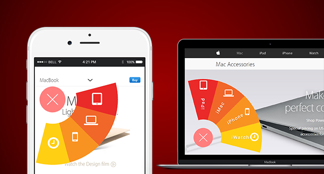
Cuppa Angular Fan Menu is an angular 1 directive for cool menu componet for web and mobile, developed using angularJS, CSS3, HTML5.
Features
- Highly Configurable directive properties and methods
- Draggable
- Touch enabled
- Cool fan effect transitions
Getting Started
Installation
-
Install with npm:
npm install cuppa-angular-datepicker.Or
-
Clonethis repository and setup with the below instructions.
Basic Usage
Include circularmenu-directive.js directive at the bottom of your page or in the <head> section.
<script src="circularmenu-directive.js" type="text/javascript"></script>
Initialize the directive by adding the directive name as a dependency to your app controller and declare the config object and menu items model as follows
angular
  .module('demoApp', ['circularMenu-directive'])
  .controller('demoController',function($scope){
    $scope.menuConfig = {
      "buttonWidth": 60,
      "menuRadius": 160,
      "color": "#ff7f7f",
      "offset":25,
      "textColor": "#ffffff",
      "showIcons":false,
      "gutter": {
        "top": 130,
        "right": 30,
        "bottom": 30,
        "left": 30
      },
      "angles": {
        "topLeft": 0,
        "topRight": 90,
        "bottomRight": 180,
        "bottomLeft": 270
      }
    };
    $scope.menuItems = [{
      "title": "iPad",
      "color": "#ea2a29",
      "rotate": 0,
      "show": 0,
      "titleColor": "#fff",
      "icon":{"color":"#fff","name":"fa fa-tablet","size": 35}
    }, {
      "title": "iMac",
      "color": "#f16729",
      "rotate": 0,
      "show": 0,
      "titleColor": "#fff",
      "icon":{"color":"#fff","name":"fa fa-laptop","size": 30}
    }, {
      "title": "iPhone",
      "color": "#f89322",
      "rotate": 0,
      "show": 0,
      "titleColor": "#fff",
      "icon":{"color":"#fff","name":"fa fa-mobile","size": 30}
    }, {
      "title": "iWatch",
      "color": "#ffcf14",
      "rotate": 0,
      "show": 0,
      "titleColor": "#fff",
      "icon":{"color":"#fff","name":"fa fa-clock-o","size": 30}
    }];
  })
Add the directive attribute and the corresponding config attributes to the html template or page of your app.
 <div drag-circular-menu
     angle="30"
     placement="topLeft"
     button-config="menuConfig"
     menu-items="menuItems"
     default-open="true"
     onwing-click="onWingClick1(wing)">
</div>
API Documentation
Directive Configuration
Once the directive attribute is added to the element, it can be configured with the following configuration attributes.
| Attribute | Type | Required | Default | Description |
|---|---|---|---|---|
drag-circular-menu |
attribute | YES | '' |
Directive attribute to be defined on an element to initialize. |
angle |
string | YES | 30 |
The angle at which the menu wings open when clicked. |
placement |
string | YES | topLeft |
Position at the which the menu appears on load. Possible values are topLeft, topRight, bottomLeft,bottomRight |
button-config |
Object | YES | None |
Menu button configuration Object. Set of button properties to be defined. Refer to Config Object Section below for details. |
menu-items |
Array [Object] | YES | none |
Array of menu item objects. Each menu is an object. Refer to the Data Array - Menu Item Object Properties below for details. |
default-open |
Boolean | YES | '' |
Open menu automatically on load. |
onwing-click |
Method | YES | '' |
Callback on menu item wing cicked. |
Config Object Properties
| Property | Type | Required | Description |
|---|---|---|---|
buttonWidth |
Number | YES | Width of the menu button. |
menuRadius |
Number | YES | The radius of the menu wings from the center of the button. |
color |
Hex Code | YES | Button color. Hex color code. |
offset |
Number | YES | The gap between the menu button and the menu item wings. |
textColor |
Hex Code | YES | Button text color. Hex color code. |
showIcons |
Boolean | YES | To show or hide icons along with the text in menu item wing. |
gutter |
Object | YES | The space between the menu and the bounderies of the page window. The object can have four properties left, right, top, bottom with values to be defined in Number |
angles |
Object | YES | The angle at which the menu opens when clicked. It can be configured to open at different angles when placed at different places. The value of the angle can be a number between 0 -360 |
Data Array
-
menuItems - Arryay [menuObject]
-
menuObject {} properties
Data Object Properties
| Property | Type | Required | Description |
|---|---|---|---|
title |
String | YES | Title of the menu item. |
color |
Hex Code | YES | Background color of the wing. |
rotate |
Number | YES | Initial angle of the wing. Default to Zero. |
show |
Boolean | YES | Show or hide the wing. |
titleColor |
Hex Code | YES | Text color of the title. |
icon |
Object | YES | Icon object properties. {“color”:”#fff”,”name”:”fa fa-tablet”,”size”: 35} |
Build & development
If you want develope and build on this component, there are some quick steps for that.
clonethe git repository to your local- run
npm installto download and install all the development dependencies. - run
bowerinstallto download all the front end developemnt dependencies. - run
grunt serveto start the server and get the app up and running. It automatically opens a browser window instance, with the app runnning. - run
grunt buildto generate production ready code in dist folder.
Licence
This project is licensed under the MIT license. See the LICENSE file for more info.
–
The MIT License (MIT) Copyright (c) 2016 Cuppa Labs
Permission is hereby granted, free of charge, to any person obtaining a copy of this software and associated documentation files (the “Software”), to deal in the Software without restriction, including without limitation the rights to use, copy, modify, merge, publish, distribute, sublicense, and/or sell copies of the Software, and to permit persons to whom the Software is furnished to do so, subject to the following conditions:
The above copyright notice and this permission notice shall be included in all copies or substantial portions of the Software.
THE SOFTWARE IS PROVIDED “AS IS”, WITHOUT WARRANTY OF ANY KIND, EXPRESS OR IMPLIED, INCLUDING BUT NOT LIMITED TO THE WARRANTIES OF MERCHANTABILITY, FITNESS FOR A PARTICULAR PURPOSE AND NONINFRINGEMENT. IN NO EVENT SHALL THE AUTHORS OR COPYRIGHT HOLDERS BE LIABLE FOR ANY CLAIM, DAMAGES OR OTHER LIABILITY, WHETHER IN AN ACTION OF CONTRACT, TORT OR OTHERWISE, ARISING FROM, OUT OF OR IN CONNECTION WITH THE SOFTWARE OR THE USE OR OTHER DEALINGS IN THE SOFTWARE.
Credits
Thanks to Font Awesome the library.
Author
Pradeep Kumar Terli
