
Overview
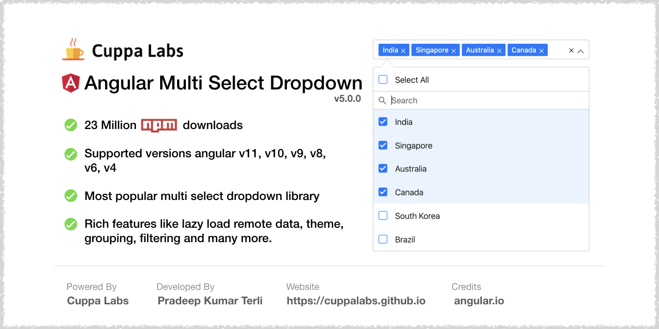
A multiselect dropdown component for angular applications. Developed in Angular 2, its easy to install and integrate.
Features
- Dropdown with multiselect.
- Filter list.
- Checkboxes.
- Check all feature.
- Single selection mode.
- Highly configurable.
Getting Started
To get started with using the multiselect dropdown component, follow the below steps. It’s easy to integrate and just a matter of minutes.
IMPORTANT !!
From v3.0.0 onwards you need to include default.themes.css file or create your theme and add it. Refer to theme section below
Installation
- The Mutiselect Dropdown package is published on the npm Registry.
- Install the package :
npm install angular2-multiselect-dropdown
- Once installed import
AngularMultiSelectModulefrom the installed package into your module as follows:
Usage
Import AngularMultiSelectModule into NgModule in app.module.ts
import { AngularMultiSelectModule } from 'angular2-multiselect-dropdown';

@NgModule({
  // ...
  imports: [
    AngularMultiSelectModule,
  ]
  // ...
})
Declare the component data variables and options in your component where you want to consume the dropdown component.
import { Component, OnInit } from '@angular/core';

export class AppComponent implements OnInit {
    dropdownList = [];
    selectedItems = [];
    dropdownSettings = {};
    ngOnInit(){
        this.dropdownList = [
                              {"id":1,"itemName":"India"},
                              {"id":2,"itemName":"Singapore"},
                              {"id":3,"itemName":"Australia"},
                              {"id":4,"itemName":"Canada"},
                              {"id":5,"itemName":"South Korea"},
                              {"id":6,"itemName":"Germany"},
                              {"id":7,"itemName":"France"},
                              {"id":8,"itemName":"Russia"},
                              {"id":9,"itemName":"Italy"},
                              {"id":10,"itemName":"Sweden"}
                            ];
        this.selectedItems = [
                                {"id":2,"itemName":"Singapore"},
                                {"id":3,"itemName":"Australia"},
                                {"id":4,"itemName":"Canada"},
                                {"id":5,"itemName":"South Korea"}
                            ];
        this.dropdownSettings = {
                                  singleSelection: false,
                                  text:"Select Countries",
                                  selectAllText:'Select All',
                                  unSelectAllText:'UnSelect All',
                                  enableSearchFilter: true,
                                  classes:"myclass custom-class"
                                };
    }
    onItemSelect(item:any){
        console.log(item);
        console.log(this.selectedItems);
    }
    OnItemDeSelect(item:any){
        console.log(item);
        console.log(this.selectedItems);
    }
    onSelectAll(items: any){
        console.log(items);
    }
    onDeSelectAll(items: any){
        console.log(items);
    }
}
Add the following component tag in you template
<angular2-multiselect [data]="dropdownList" [(ngModel)]="selectedItems"
    [settings]="dropdownSettings"
    (onSelect)="onItemSelect($event)"
    (onDeSelect)="OnItemDeSelect($event)"
    (onSelectAll)="onSelectAll($event)"
    (onDeSelectAll)="onDeSelectAll($event)">
</angular2-multiselect>
Template - For custom html of menu item
<angular2-multiselect [data]="dropdownList" [(ngModel)]="selectedItems" [settings]="dropdownSettings">
  <c-item>
          <ng-template let-item="item">
            <label style="color: #333;min-width: 150px;"></label>
            <img [src]="item.image" style="width: 30px; border: 1px solid #efefef;margin-right: 20px;" />
            <label>Capital - </label>
          </ng-template>
  </c-item>
</angular2-multiselect>
Themes and Theming
- From v3.0.0 onwards, you need to include
default.theme.cssfile to get the basic styling of the dropdown. - The component package has a themes folder in node_modules at
angular2-multiselect-dropdown\themes\default.theme.css - Include the
default.theme.cssinangular-cli.json(for versions below angular 6) andangular.json(for version 6 or more). - Refer this file on how to add the css file to your angular project.
You can create your own theme from now on. You can have a look at example scss theming file at Default theme
Using with Template Driven Forms
Include the dropdown tag in the form html as follows
<form (ngSubmit)="onSubmit()" #loginForm="ngForm" style="border: 1px solid #ccc; padding: 10px;">
        <div class="form-group">
            <label for="name">Skills</label>
            <angular2-multiselect [data]="itemList" [(ngModel)]="formModel.skills"
                                  [settings]="settings"
                                  (onSelect)="onItemSelect($event)"
                                  (onDeSelect)="OnItemDeSelect($event)"
                                  (onSelectAll)="onSelectAll($event)"
                                  (onDeSelectAll)="onDeSelectAll($event)" name="skills">
            </angular2-multiselect>
        </div>
</form>
Initiatie the formModel as below:
formModel = {
        name: null,
        email: '',
        skills: []
};
Using with Reactive Forms
Incluse the dropdwon in reactive form way as below
<form [formGroup]="userForm" novalidate>
        <div class="form-group">
            <label for="name">Skills</label>
           <angular2-multiselect [data]="itemList" [(ngModel)]="selectedItems"
                                  [settings]="settings"
                                  (onSelect)="onItemSelect($event)"
                                  (onDeSelect)="OnItemDeSelect($event)"
                                  (onSelectAll)="onSelectAll($event)"
                                  (onDeSelectAll)="onDeSelectAll($event)" formControlName="skills">
            </angular2-multiselect>
        </div>
        <div class="form-group">
            <label for="name">Name</label>
            <input class="form-control" formControlName="name">
        </div>
        <div class="form-group">
            <label for="name">Email Address</label>
            <input class="form-control" formControlName="email">
        </div>
        <button (click)="submitForm()" [disabled]="!userForm.valid" class="btn btn-success btn-block">Submit</button>
</form>
Initiate the form using formGroup module as below:
userForm: FormGroup;
this.userForm = this.fb.group({
            name: '',
            email: ['', Validators.required],
            skills: [[], Validators.required]
        });
Configuration Settings
The following list of settings are supported by the component. Configure the settings to meet your requirement.
| Setting | Type | Description | Default |
|---|---|---|---|
| singleSelection | Boolean | To set the dropdown for single item selection only. | false |
| text | String | Text to be show in the dropdown, when no items are selected. | ‘Select’ |
| enableCheckAll | Boolean | Enable the option to select all items in list | false |
| selectAllText | String | Text to display as the label of select all option | Select All |
| unSelectAllText | String | Text to display as the label of unSelect option | UnSelect All |
| enableSearchFilter | Boolean | Enable filter option for the list. | false |
| enableFilterSelectAll | Boolean | A ‘select all’ checkbox to select all filtered results. | true |
| filterSelectAllText | String | Text to display as the label of select all option | Select all filtered results |
| filterUnSelectAllText | String | Text to display as the label of unSelect option | UnSelect all filtered results |
| maxHeight | Number | Set maximum height of the dropdown list in px. | 300 |
| badgeShowLimit | Number | Limit the number of badges/items to show in the input field. If not set will show all selected. | All |
| classes | String | Custom classes to the dropdown component. Classes are added to the dropdown selector tag. To add multiple classes, the value should be space separated class names. | ’’ |
| limitSelection | Number | Limit the selection of number of items from the dropdown list. Once the limit is reached, all unselected items gets disabled. | none |
| disabled | Boolean | Disable the dropdown | false |
| searchPlaceholderText | String | Custom text for the search placeholder text. Default value would be ‘Search’ | ‘Search’ |
| groupBy | String | Name of the field by which the list should be grouped. | none |
| searchAutofocus | Boolean | Autofocus search input field | true |
| labelKey | String | The property name which should be rendered as label in the dropdown | itemName |
| primaryKey | String | The property by which the object is identified. Default is ‘id’. | id |
| position | String | Set the position of the dropdown list to ‘top’ or ‘bottom’ | bottom |
| noDataLabel | String | Label text when no data is available in the list | ‘No Data Available’ |
| searchBy | Array | Search the list by certain properties of the list item. Ex: [“itemName, “id”,”name”]. Deafult is , it will search the list by all the properties of list item | [] |
| lazyLoading | Boolean | Enable lazy loading. Used to render large datasets. | false |
| showCheckbox | Boolean | Show or hide checkboxes in the list | true |
Events
onSelect- Return the selected item on selection. Example : (onSelect)=”onItemSelect($event)”onDeSelect- Return the un-selected item on un-selecting. Example : (onDeSelect)=”OnItemDeSelect($event)”onSelectAll- Return the list of all selected items. Example : (onSelectAll)=”onSelectAll($event)”onDeSelectAll- Returns an empty array. Example : (onDeSelectAll)=”onDeSelectAll($event)”onOpen- Callback method fired after the dropdown opens Example : (onOpen)=”onOpen($event)”onClose- Callback method, fired when the dropdown is closed Example : (onClose)=”onClose($event)”
Run locally
- Clone the repository or downlod the .zip,.tar files.
- Run
npm install - Run
ng servefor a dev server - Navigate to
http://localhost:4200/
License
MIT License.