Overview
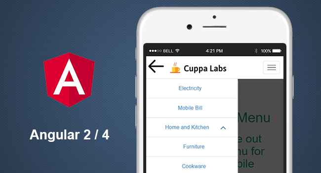
Hamburger menu for mobile and web is very common feature and a must have in app development. An angular 2 slide navigation menu component for mobile and web. Hamburger kind of menu for mobile and web is very common feature and a must have as well, these days.
Getting Started
Installation
- The Slide menu package is published on the npm Registry.
-
Install the package :
npm install cuppa-ng2-slidemenu - Once installed import
SlideMenuModulefrom the installed package into your module as follows:
import { SlideMenuModule } from 'cuppa-ng2-slidemenu/cuppa-ng2-slidemenu';
Usage
- Import the
SlideMenuModulein yourngModuleas follows:
import { NgModule } from '@angular/core';
import { BrowserModule } from '@angular/platform-browser';
import { SlideMenuModule } from 'cuppa-ng2-slidemenu/cuppa-ng2-slidemenu';
import { AppComponent } from './app.component';

@NgModule({
   bootstrap: [ AppComponent ],
   declarations: [AppComponent],
   imports: [SlideMenuModule] // Import SlideMenu module variable here
})
export class AppModule {
}
- Place the component html tag in the template where the hamburger menu needs to be rendered.
<cuppa-slidemenu [menulist]="menuItemsArray" (open)="onMenuOpen()" (close)="onMenuClose()" (onItemSelect)="onItemSelect($event)"></cuppa-slidemenu>
- Component requires a
menulistto pass data as array of objects to the component, as follows:
private menuItemsArray: any[] = [
       {"title":"Electricity","link":"#"},
       {"title":"Mobile Bill","link":"#"},
       {"title":"Home and Kitchen","link":"#",
       "subItems":[
                   {"title":"Furniture","link":"#"},
                   {"title":"Cookware","link":"#"},
                  ]
       },
       {"title":"Car and Bike Accessories","link":"#",
        "subItems":[
                     {"title":"Tyres and Alloys","link":"#"},
                     {"title":"Comfort and Safety","link":"#"},
                    ]
       },
 ];

  public onMenuClose(){
    console.log("menu closed");
  }
  public onMenuOpen(){
    console.log("menu Opened");
  }
  private onItemSelect(item:any){
    console.log(item);
  }
Configuration Settings
| Property | type | description | default |
|---|---|---|---|
| animation | string | name of the hamburger animation. Refer to the below list of supported animation types | collapse |
| offset | object “offset”: {“top”: 55} | The offset value of the menu from top, left, right and bottom | 0 |
| closeOnCLick | boolean | To close the menu as soo as an item is selected. | false |
Supported animations list :
- 3dx
- 3dx-r
- 3dy
- 3dy-r
- 3dxy
- 3dxy-r
- arrow
- arrow-r
- arrowalt
- arrowalt-r
- arrowturn
- arrowturn-r
- boring
- collapse
- collapse-r
- elastic
- elastic-r
- emphatic
- emphatic-r
- minus
- slider
- slider-r
- spin
- spin-r
- spring
- spring-r
- stand
- stand-r
- squeeze
- vortex
- vortex-r
Callback API
onMenuClose()- This method is triggered when menu is closed.onMenuOpen()- Triggered when menu is opened.onItemSelect(item:any)- Triggered when a menu item is selected. Returns the selected menu item object.
Dependencies
Font-awesomeis required for the icons in component.
Thats all Folks !! You are good to go.
View the Demo here.
Please raise any issues here
To run the code and build in your local, follw the below steps
- git clone
https://github.com/CuppaLabs/cuppa-ng2-slidemenu.git - npm install
- ng serve
- Go to
http://localhost:4200where your app will run.
Credits
Thanks to font awesome for the wonderful font icons.
Licence
This project is licensed under the MIT license. See the LICENSE file for more info.
–
The MIT License (MIT) Copyright (c) 2016 Cuppa Labs
Permission is hereby granted, free of charge, to any person obtaining a copy of this software and associated documentation files (the “Software”), to deal in the Software without restriction, including without limitation the rights to use, copy, modify, merge, publish, distribute, sublicense, and/or sell copies of the Software, and to permit persons to whom the Software is furnished to do so, subject to the following conditions:
The above copyright notice and this permission notice shall be included in all copies or substantial portions of the Software.
THE SOFTWARE IS PROVIDED “AS IS”, WITHOUT WARRANTY OF ANY KIND, EXPRESS OR IMPLIED, INCLUDING BUT NOT LIMITED TO THE WARRANTIES OF MERCHANTABILITY, FITNESS FOR A PARTICULAR PURPOSE AND NONINFRINGEMENT. IN NO EVENT SHALL THE AUTHORS OR COPYRIGHT HOLDERS BE LIABLE FOR ANY CLAIM, DAMAGES OR OTHER LIABILITY, WHETHER IN AN ACTION OF CONTRACT, TORT OR OTHERWISE, ARISING FROM, OUT OF OR IN CONNECTION WITH THE SOFTWARE OR THE USE OR OTHER DEALINGS IN THE SOFTWARE.
Author
Pradeep Kumar Terli @ Cuppa Labs
